How to Use Data Stories to Present Research Findings
In today’s fast-paced world, where information overload is the norm, the ability to convey research findings in an engaging and understandable manner has never been more crucial. Data storytelling is an innovative approach that transforms raw numbers and statistics into compelling narratives that resonate with diverse audiences. Imagine you’re at a party, and someone starts sharing a fascinating story about their recent adventure. Suddenly, everyone is captivated, hanging on their every word. That’s the essence of data storytelling—it turns complex information into relatable tales that not only inform but also inspire.
At its core, data storytelling is about making sense of the chaos. It’s not just about presenting data; it’s about creating a connection between the data and the audience. By weaving facts into a narrative structure, researchers can enhance comprehension and retention, ensuring that their findings are not just heard but remembered. Think of it like a movie: a good plot keeps viewers engaged, while a poorly told story leads to confusion and disinterest. So, how can you craft a data story that truly captivates your audience?
Data storytelling is essential for several reasons. First, it enhances the clarity of the information being presented. When data is simply displayed as numbers or charts, it can be overwhelming. However, when it’s embedded within a story, it becomes easier to digest. Second, stories evoke emotions. By presenting data in a narrative format, researchers can forge a stronger emotional connection with their audience, which can drive action and inspire change. Just think about it: when was the last time you were moved by a statistic alone?
One of the first steps in crafting a compelling data story is understanding your audience. Who are they? What do they care about? Different groups may require varying levels of detail and types of visuals to grasp the significance of your findings. For example, a group of seasoned professionals may appreciate in-depth analysis, while a general audience might benefit from simplified visuals and straightforward explanations.
Analyzing the demographics of your audience can significantly influence how you present your research. Knowing whether your audience is made up of industry experts, students, or the general public can help you customize your presentation. For instance, if your audience consists of young professionals, you might want to incorporate contemporary design elements and relatable examples that resonate with their experiences.
Understanding the professional background of your audience is equally important. This knowledge aids in selecting appropriate terminology and examples that enhance understanding. If you’re presenting to a group of healthcare professionals, using medical jargon might be acceptable. However, if your audience is comprised of non-specialists, it’s crucial to simplify the language and avoid technical terms that could alienate them.
Identifying the interests and needs of your audience allows you to focus on relevant aspects of your research. This tailored approach not only increases engagement but also enhances the likelihood of actionable insights. For example, if your research addresses a pressing issue within a specific community, highlighting that connection can make your data story more impactful and memorable.
A well-structured narrative arc is essential for effective data storytelling. It guides the audience through the research journey, from introduction to conclusion, ensuring clarity and coherence. Just like a good book or movie, your data story should have a beginning that sets the stage, a middle that presents the findings, and an end that wraps everything up with a clear takeaway. This structure helps maintain the audience’s attention and makes the information more digestible.
Visual elements play a crucial role in data storytelling. Effective data visualization can simplify complex information, making it easier for audiences to grasp key insights quickly. Think of visuals as the seasoning in a dish; the right amount can enhance the flavor, while too much can overwhelm the palate. Selecting the right visuals is about striking that balance.
Selecting appropriate visuals, such as charts and infographics, enhances the narrative. The right visuals can highlight trends and patterns, making your findings more accessible. For example, a well-designed infographic can convey a wealth of information at a glance, allowing your audience to absorb key points without getting lost in the details.
Applying design principles like contrast, alignment, and hierarchy ensures that your visuals communicate effectively. Clear and well-designed visuals can significantly improve audience understanding and engagement. Remember, the goal is to make your data story as engaging and informative as possible. A cluttered or poorly designed visual can detract from your message, leaving your audience confused rather than enlightened.
- What is data storytelling?
Data storytelling is the practice of combining data with narrative elements to communicate findings in a compelling and relatable way.
- Why is understanding your audience important?
Knowing your audience helps tailor your presentation to their interests and comprehension levels, making your data story more impactful.
- How can I choose the right visuals for my data story?
Consider the key insights you want to convey and select visuals that highlight those points clearly and effectively.

The Importance of Data Storytelling
This article explores the art of crafting compelling data stories that effectively communicate research findings, making complex information accessible and engaging for diverse audiences.
In today's information-saturated world, data storytelling has emerged as a powerful tool for researchers and communicators alike. It’s not just about presenting numbers and graphs; it’s about weaving those elements into a narrative that resonates with the audience. Imagine trying to explain a complex concept without a story—it's like trying to navigate a maze without a map. Data storytelling transforms raw data into relatable narratives, enhancing comprehension and retention.
When researchers present their findings, they often face the challenge of making complex data understandable. By integrating facts into a story, researchers can create a stronger emotional connection with their audience. This connection is crucial because people are more likely to remember information that is presented in a narrative format rather than as a series of disjointed statistics. In fact, studies show that stories can improve memory retention by up to 22 times compared to facts alone!
Consider this: when you hear a story, your brain lights up in ways that it doesn’t when you’re just processing data. This is because stories engage our emotions, making us more receptive to the information being shared. By using data storytelling, researchers can:
- Clarify Complex Information: Simplifying intricate data sets into understandable narratives.
- Engage the Audience: Capturing attention and maintaining interest through relatable stories.
- Drive Action: Inspiring decision-making by highlighting the implications of the data.
Moreover, data storytelling allows researchers to emphasize the significance of their findings. It’s not just about what the data shows but also about why it matters. For instance, instead of merely stating that “70% of respondents prefer option A,” a storyteller might say, “Imagine a world where 70% of people choose option A; this could lead to a significant shift in our industry.” This approach not only presents the data but also paints a vivid picture of its potential impact.
In summary, the importance of data storytelling cannot be overstated. It serves as a bridge between complex data and audience understanding, turning numbers into narratives that inform, engage, and inspire. By embracing the art of storytelling, researchers can ensure their findings are not just heard but truly understood and acted upon.
Understanding your audience is crucial for tailoring your data story. Different groups may require varying levels of detail and types of visuals to grasp the significance of your findings.
Analyzing demographics helps in customizing your presentation. Knowing your audience's preferences ensures that your data story resonates, making it more impactful and memorable.
Consider the professional background of your audience when presenting data. This knowledge aids in selecting appropriate terminology and examples that enhance understanding.
Identifying the interests and needs of your audience allows you to focus on relevant aspects of your research, increasing engagement and the likelihood of actionable insights.
A well-structured narrative arc is essential for effective data storytelling. It guides the audience through the research journey, from introduction to conclusion, ensuring clarity and coherence.
Visual elements play a crucial role in data storytelling. Effective data visualization can simplify complex information, making it easier for audiences to grasp key insights quickly.
Selecting appropriate visuals, such as charts and infographics, enhances the narrative. The right visuals can highlight trends and patterns, making your findings more accessible.
Applying design principles like contrast, alignment, and hierarchy ensures that your visuals communicate effectively. Clear and well-designed visuals can significantly improve audience understanding and engagement.
Q: What is data storytelling?
A: Data storytelling is the practice of using narrative techniques to present data in a way that is engaging and easy to understand.
Q: Why is data storytelling important?
A: It helps to clarify complex information, engage the audience, and drive action by emphasizing the significance of the findings.
Q: How can I improve my data storytelling skills?
A: Practice crafting narratives around your data, focus on your audience's needs, and utilize effective visuals to enhance your story.

Identifying Your Audience
When it comes to presenting your research findings, one of the most critical steps is . Think of it like throwing a party; you wouldn't serve sushi to a group of people who prefer pizza, right? Understanding who you're speaking to allows you to tailor your data story in a way that resonates with them, making your message not just heard, but felt. Each audience has its own unique set of characteristics, preferences, and knowledge levels that shape how they interpret information. By recognizing these factors, you can create a narrative that captivates and engages.
To effectively identify your audience, consider a few key elements that can guide your approach:
- Demographics: Age, gender, education level, and profession can significantly influence how your audience perceives data. For instance, a group of seasoned researchers may appreciate complex statistical analyses, while a general audience might prefer a simpler, more visual representation of the same data.
- Interests: What does your audience care about? Knowing their interests can help you highlight the most relevant aspects of your research. If your audience is passionate about environmental issues, emphasizing the ecological impact of your findings can create a stronger connection.
- Needs: Understanding what your audience hopes to gain from your presentation is crucial. Are they looking for actionable insights, or are they more interested in theoretical implications? Tailoring your story to meet these needs can greatly enhance engagement.
Additionally, it's important to consider the professional background of your audience. Are they industry experts, academics, or laypersons? This knowledge helps you choose the right terminology and examples that will resonate. For example, using jargon with a specialized audience might be appropriate, but for a broader group, it could lead to confusion or disengagement.
In summary, identifying your audience is not just a preliminary step; it’s the foundation of effective data storytelling. By understanding who you’re speaking to and what they care about, you can craft a narrative that not only informs but also inspires action. So, take the time to analyze your audience’s demographics, interests, and needs, and watch as your data story transforms into a compelling narrative that captivates everyone in the room.
Q: Why is it important to identify my audience before presenting data?
A: Knowing your audience allows you to tailor your message to their interests and comprehension levels, making your presentation more effective and engaging.
Q: How can I learn about my audience's demographics?
A: You can conduct surveys, review existing data, or simply ask questions during preliminary discussions to better understand your audience's background.
Q: What if my audience has mixed backgrounds?
A: In such cases, aim for a middle ground in your presentation. Use clear, accessible language and provide explanations for more complex concepts to ensure everyone can follow along.

Demographics and Preferences
When it comes to crafting a compelling data story, understanding your audience's demographics and preferences is like having a treasure map. It's essential to dig deep into who your audience is, as this knowledge allows you to tailor your narrative to resonate with them on a personal level. Think of it as tuning into a radio station; if you don't know the right frequency, your message will get lost in static. For instance, consider the age, gender, educational background, and cultural context of your audience. These factors significantly influence how they interpret data.
Moreover, preferences play a pivotal role in how effectively your message is received. Does your audience prefer detailed reports or concise summaries? Are they more inclined toward visual representations or textual explanations? Understanding these preferences helps in crafting a narrative that not only informs but also engages. For example, younger audiences might gravitate towards interactive visuals and social media snippets, while older demographics may favor traditional graphs and in-depth analysis.
To illustrate the importance of demographics and preferences, let’s consider a few key aspects:
- Age Groups: Different age groups have varying levels of familiarity with data. Younger audiences might be more tech-savvy, while older generations may appreciate straightforward presentations.
- Industry Background: Professionals from different sectors interpret data differently. For instance, a healthcare audience might focus on patient outcomes, while a tech audience might prioritize data security.
- Cultural Influences: Cultural backgrounds can shape how data is perceived. What resonates with one culture might not have the same impact on another.
By analyzing these demographics and preferences, you can customize your data story to ensure it strikes a chord with your audience. This approach not only enhances engagement but also increases the likelihood of your findings being understood and acted upon. Remember, the goal is to make your data relatable and relevant. When your audience sees themselves in the story you tell, they are more likely to connect with the information and carry it forward.

Professional Background
When it comes to presenting data, understanding your audience's is not just a nice-to-have; it's a game changer. Imagine you’re at a party, and you start talking about your favorite book. If your audience consists of avid readers, they'll likely engage deeply, but if they’re more into movies, they might tune out. The same principle applies to data storytelling. Knowing the professional backgrounds of your audience members can significantly influence how you present your findings.
For instance, if your audience is composed of data scientists, you can dive deep into technical jargon and complex statistical methods without losing them. They’ll appreciate the nuances and might even ask for more detailed analyses. On the other hand, if your audience includes executives or stakeholders, who may not have a data-centric background, you'll want to simplify your language and focus on the implications of your findings rather than the intricate details of your methodology.
To tailor your presentation effectively, consider the following points about your audience's professional background:
- Industry Knowledge: Are they familiar with the industry your research pertains to? This will help you gauge how much background information you need to provide.
- Technical Expertise: Assess their level of expertise in data analysis. This will dictate whether you should include technical terms or stick to plain language.
- Decision-Making Role: Understanding whether your audience is in a decision-making position can help you focus on actionable insights that resonate with their responsibilities.
By considering these aspects, you can create a more engaging and relevant data story. For example, if you're presenting to a group of healthcare professionals, you might want to include case studies or real-world applications of your research findings that directly relate to patient care. This approach not only makes your data more relatable but also highlights its practical significance, making your audience more likely to pay attention and act on your recommendations.
In summary, the professional background of your audience shapes the lens through which they view your data. By tailoring your presentation to fit their knowledge and interests, you can foster a more meaningful dialogue, turning what could be a dry presentation into an engaging conversation. Remember, the goal is to make your findings not just understood, but also appreciated and actionable.
- Why is understanding my audience's professional background important?
Understanding your audience's background helps tailor your presentation to their level of expertise, making your data story more engaging and impactful. - How can I identify my audience's professional background?
Research your audience ahead of time, consider their roles, industries, and previous interactions with data to better understand their perspectives. - What should I focus on when presenting to a non-technical audience?
Focus on the implications and real-world applications of your findings, using simple language and relatable examples to convey your message.

Interests and Needs
Understanding the of your audience is fundamental when crafting a compelling data story. Imagine you’re at a dinner party, and the host serves a dish that caters to everyone’s tastes—this is the essence of tailoring your presentation. By recognizing what your audience cares about, you can focus on the aspects of your research that will resonate most with them. This not only captures their attention but also makes your findings more relevant and impactful.
For instance, if your research is centered around environmental sustainability, and your audience consists of local business owners, they may be particularly interested in how sustainable practices can improve their bottom line. Conversely, if your audience is made up of policymakers, they might be more focused on the broader implications of your findings for community health and safety. By aligning your data story with their interests, you ensure that your message is not just heard but also valued.
To effectively identify these interests, consider the following strategies:
- Conduct Surveys: Before your presentation, gather insights through surveys to understand what your audience is curious about.
- Engage in Dialogue: If possible, have conversations with potential audience members to gauge their interests and expectations.
- Analyze Past Engagements: Review previous presentations or reports to see which topics generated the most interest and discussion.
Additionally, addressing the needs of your audience is equally important. Needs can be categorized into several areas, such as:
- Knowledge Gaps: What information do they lack that your research can fill?
- Actionable Insights: What practical steps can they take based on your findings?
- Emotional Resonance: How can your data story evoke feelings that motivate action?
By considering both the interests and needs of your audience, you can create a data story that not only informs but also inspires. Ultimately, your goal is to transform complex data into a narrative that speaks directly to your audience, making them feel like active participants in the journey of discovery. This connection is what turns passive listeners into engaged advocates for your research.
- What is data storytelling? Data storytelling is the practice of using narrative techniques to communicate insights derived from data, making complex information more relatable and engaging.
- Why is it important to know my audience? Understanding your audience allows you to tailor your message, ensuring that it resonates and meets their specific interests and needs.
- How can I visualize data effectively? Use clear and relevant visuals such as charts and infographics that highlight key trends and insights while adhering to design principles for clarity.

Creating a Narrative Arc
When it comes to data storytelling, crafting a compelling narrative arc is like building the backbone of your story. Think of it as the blueprint that guides your audience from the initial hook to the climactic conclusion. Just like every great story has a beginning, middle, and end, your data story should follow a similar structure to ensure clarity and coherence. But what exactly does this entail? Let’s break it down.
The first step in creating a narrative arc is to set the stage. This involves introducing your research question or the problem you are addressing. Start with a compelling hook that grabs your audience's attention. You might ask a thought-provoking question or present a surprising fact that makes them want to learn more. For instance, if your research reveals alarming trends in public health, you could open with a striking statistic that highlights the urgency of the issue.
Next, you move into the rising action. This is where you delve into the data and begin to present your findings. Here, it's crucial to organize your information logically. You might want to group related data points together or use a chronological approach to illustrate how the situation has evolved over time. This section is where your audience starts to see the significance of your research, so make sure to use clear and impactful visuals to support your narrative. For example, a well-designed chart can effectively illustrate trends that might otherwise be lost in a sea of numbers.
As you progress, you’ll reach the climax of your narrative arc, where the most critical insights are revealed. This is the moment your audience has been waiting for—the point where everything comes together and the implications of your findings become clear. It’s essential to present this information with confidence and clarity, as it will leave a lasting impression. You might say something like, “Our findings indicate that X has increased by Y% over the past decade, leading to Z consequences.” This is your chance to drive home the importance of your research.
Finally, you’ll want to wrap things up with the resolution. This is where you summarize your key findings and reiterate their significance. It’s also an opportunity to suggest actionable insights or next steps based on your research. What should your audience do with this information? How can it influence policy, practices, or further research? By providing clear takeaways, you empower your audience to engage with your findings on a deeper level.
In summary, creating a narrative arc involves:
- Setting the Stage: Introduce your research question or problem.
- Rising Action: Present your findings logically and support them with visuals.
- Climax: Reveal the most critical insights with clarity.
- Resolution: Summarize key findings and suggest actionable insights.
By following this structure, you can transform your data into a story that not only informs but also resonates with your audience. Remember, the goal is to make complex information accessible and engaging, allowing your audience to connect emotionally with your research. So, the next time you're preparing to present your findings, think of your narrative arc as the thread that weaves your data together into a captivating story.
Q: What is data storytelling?
A: Data storytelling is the practice of using narrative techniques to communicate insights derived from data. It combines data visualization, narrative, and context to make complex information more understandable and engaging.
Q: Why is a narrative arc important in data storytelling?
A: A narrative arc helps structure your presentation, guiding the audience through your findings in a logical and engaging manner. It enhances comprehension and retention by providing a clear beginning, middle, and end.
Q: How can I choose the right visuals for my data story?
A: Consider the key messages you want to convey and select visuals that best illustrate those points. Charts, graphs, and infographics are often effective, but ensure they are clear and relevant to your narrative.

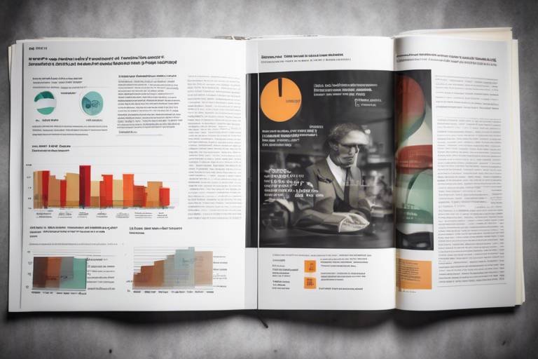
Visualizing Data Effectively
When it comes to presenting research findings, visualization is not just a cherry on top; it’s the whole cake! Think about it: our brains are wired to process images far quicker than text. This means that effective data visualization can be a game-changer in how your audience understands your research. By transforming complex data sets into visually engaging formats, you can make your findings not only more accessible but also more memorable. Imagine trying to explain a complicated dataset with just words; it would be like trying to describe a beautiful sunset without mentioning the colors!
So, how do you go about ? It starts with choosing the right type of visual representation. Depending on the nature of your data, you have numerous options at your disposal, including bar charts, line graphs, pie charts, and infographics. Each of these serves a different purpose and can highlight various aspects of your findings. For instance, if you're looking to show trends over time, a line graph could be your best bet. On the other hand, if you want to represent proportions, a pie chart might do the trick.
Additionally, the design of your visual elements is crucial. Applying fundamental design principles can significantly enhance clarity and comprehension. Here are some key principles to keep in mind:
- Contrast: Use contrasting colors to differentiate between various data points, making it easier for your audience to discern key information.
- Alignment: Ensure that all elements are well-aligned to create a cohesive look, which helps in guiding the viewer’s eye through the data.
- Hierarchy: Establish a visual hierarchy by varying the size and weight of fonts and elements, directing attention to the most important parts of your data.
Let’s not forget about the importance of context. When presenting visuals, it’s essential to provide context to your audience. This means not just throwing a chart in front of them but also explaining what it represents. For instance, if you’re showing a sales growth chart, accompany it with a brief narrative about what factors contributed to that growth. This additional information can turn your visuals from mere decorations into powerful storytelling tools.
To illustrate how effective visualization can transform data, consider the following table that compares different types of visuals and their best uses:
| Type of Visual | Best Used For | Example |
|---|---|---|
| Bar Chart | Comparing quantities across categories | Sales by Region |
| Line Graph | Showing trends over time | Website Traffic Growth |
| Pie Chart | Displaying proportions of a whole | Market Share Distribution |
| Infographic | Combining data with narrative | Annual Report Overview |
Ultimately, the goal of visualizing data is to create a narrative that resonates with your audience. When done right, your visuals can serve as a bridge that connects your research findings to your audience’s understanding, making complex information not just digestible but also engaging. So, the next time you’re preparing to present your research, remember: it’s not just about the data; it’s about how you tell the story behind it through effective visualization.
Q: Why is data visualization important?
A: Data visualization is crucial because it helps to simplify complex data sets, making it easier for audiences to understand and retain information.
Q: What types of visuals should I use for my data?
A: The type of visual depends on the data you’re presenting. For trends, use line graphs; for comparisons, bar charts; and for proportions, pie charts.
Q: How can I ensure my visuals are clear?
A: Apply design principles such as contrast, alignment, and hierarchy to enhance clarity and ensure your visuals communicate effectively.

Choosing the Right Visuals
When it comes to presenting data, choosing the right visuals is like picking the perfect outfit for a big event. You want to make a lasting impression, and the right visuals can do just that! Visuals are not just decorative elements; they are powerful tools that can transform complex data into easily digestible information. Imagine trying to explain a complicated concept without any visuals—it's like trying to navigate a maze blindfolded. By selecting the appropriate visuals, you can guide your audience through the labyrinth of data, helping them uncover insights along the way.
One of the key factors in choosing the right visuals is understanding the type of data you are working with. For instance, if your research findings involve comparisons, bar charts are your best friends. They allow viewers to quickly see differences between categories. On the other hand, if you’re illustrating trends over time, a line graph would be more effective, as it clearly shows how data points change across a timeline. In short, the type of data should dictate the type of visual you choose.
Additionally, consider the audience's familiarity with the subject matter. Are they experts in the field or newcomers? For a more specialized audience, you might opt for detailed charts that include a lot of information. However, if your audience is less familiar, simpler visuals like pie charts or infographics can help convey your message without overwhelming them. Remember, the goal is to enhance understanding, not to confuse your viewers!
Incorporating colors and design elements can also significantly impact how your visuals are perceived. Using a consistent color scheme not only makes your presentation look professional but also helps to categorize information effectively. For example, using shades of blue for one category and shades of orange for another can help your audience differentiate between the two at a glance. However, be cautious not to overdo it—too many colors can lead to confusion. Aim for a balance that maintains clarity while still being visually engaging.
Moreover, don't forget about accessibility. Ensure that your visuals are easy to understand for everyone, including those with color blindness or visual impairments. Using patterns in addition to colors or providing text descriptions can make your visuals more inclusive. Remember, the aim is to communicate, and that means making your data accessible to all.
In summary, choosing the right visuals involves a mix of understanding your data, knowing your audience, and applying thoughtful design principles. By carefully selecting visuals that complement your narrative, you can enhance the impact of your data story and ensure that your audience walks away with a clear understanding of your research findings.
- What types of visuals are best for presenting data? The best types of visuals depend on the data you are presenting. Bar charts are great for comparisons, line graphs for trends, and pie charts for parts of a whole.
- How can I make my visuals more accessible? Use patterns in addition to colors, provide text descriptions, and ensure that your font sizes are legible for everyone.
- Should I use complex visuals for expert audiences? While experts may appreciate detailed visuals, ensure that they are still clear and straightforward to avoid confusion.

Design Principles for Clarity
When it comes to data storytelling, clarity is king. Imagine trying to navigate through a dense fog; without clear visuals, your audience may feel just as lost when confronted with complex data. The key to effective communication lies in applying fundamental design principles that enhance understanding and engagement. By focusing on aspects such as contrast, alignment, and hierarchy, you can create visuals that not only convey information but also resonate with your audience.
Contrast is crucial in making your visuals stand out. Think of it as the difference between night and day; without contrast, important elements can blend into the background, leaving your audience confused. For instance, using contrasting colors for your data points against a neutral background can draw attention to key findings. This simple but effective technique ensures that the most critical information pops, guiding the viewer’s eye to what really matters.
Next, let’s talk about alignment. A well-aligned visual not only looks cleaner but also helps in organizing information logically. Imagine a cluttered desk versus a neatly arranged one; the latter allows you to find what you need quickly. Similarly, aligning elements in your charts or infographics helps your audience navigate the data more easily. Whether it's aligning text, numbers, or graphical elements, a tidy layout can significantly improve comprehension and retention.
Then we have hierarchy, which plays a pivotal role in guiding the viewer's attention. Just like a good story has a beginning, middle, and end, your visuals should lead the viewer through the data in a structured manner. Use size, color, and placement to create a visual hierarchy that emphasizes the most important information first. For example, larger fonts can denote headings or key points, while smaller text can provide supporting details. This method not only helps in prioritizing information but also makes it easier for your audience to digest the content.
To illustrate these principles, consider the following table that summarizes how each design principle can be applied to your data visuals:
| Design Principle | Application | Impact |
|---|---|---|
| Contrast | Use contrasting colors for data points | Highlights key findings |
| Alignment | Organize elements logically | Improves navigation and clarity |
| Hierarchy | Size and color to emphasize importance | Guides attention effectively |
In conclusion, applying these design principles can dramatically enhance the clarity of your data storytelling. By ensuring that your visuals are not only aesthetically pleasing but also functional, you can create a more engaging experience for your audience. Remember, the goal is to make your data accessible and memorable, transforming complex information into digestible insights that anyone can understand.
- What is data storytelling? Data storytelling is the practice of using narrative techniques to convey insights from data, making it easier for audiences to understand complex information.
- Why is clarity important in data visualization? Clarity ensures that your audience can quickly grasp the key insights from your data, leading to better decision-making and engagement.
- How can I improve my data visuals? Focus on design principles like contrast, alignment, and hierarchy to enhance the readability and impact of your visuals.
- What types of visuals should I use? Depending on your data, consider using charts, infographics, and maps that best highlight your key findings and trends.
Frequently Asked Questions
- What is data storytelling?
Data storytelling is the art of transforming complex data into relatable narratives. It combines data visualization with storytelling techniques to make research findings more accessible and engaging for various audiences.
- Why is identifying my audience important?
Understanding your audience is crucial because it allows you to tailor your data story to their specific needs and preferences. Different audiences may require different levels of detail and types of visuals to fully grasp the significance of your findings.
- How do I create a narrative arc for my data story?
A narrative arc guides your audience through your research journey. Start with an introduction that sets the stage, followed by the main findings, and conclude with insights or recommendations. This structure ensures clarity and coherence, making it easier for your audience to follow along.
- What types of visuals should I use in my data story?
Choosing the right visuals is key to effective data storytelling. Consider using charts, infographics, and graphs that best illustrate your data. Selecting visuals that highlight trends and patterns can significantly enhance your audience's understanding of your findings.
- What design principles should I follow for clarity?
Applying design principles such as contrast, alignment, and hierarchy can improve the effectiveness of your visuals. Well-designed visuals help communicate your message clearly, ensuring that your audience can easily grasp the key insights from your research.
- How can I make my data story more engaging?
To make your data story more engaging, focus on creating a strong emotional connection with your audience. Use relatable anecdotes, clear visuals, and a compelling narrative to draw them in. Remember, the goal is to make the data resonate with your audience on a personal level.
- Can I use humor in my data storytelling?
Absolutely! Using humor can be an effective way to engage your audience and make complex information more relatable. Just ensure that the humor aligns with your message and audience's sensibilities to maintain professionalism.